Case study / Rules engine
LogicX
Making powerful automation easier to understand.
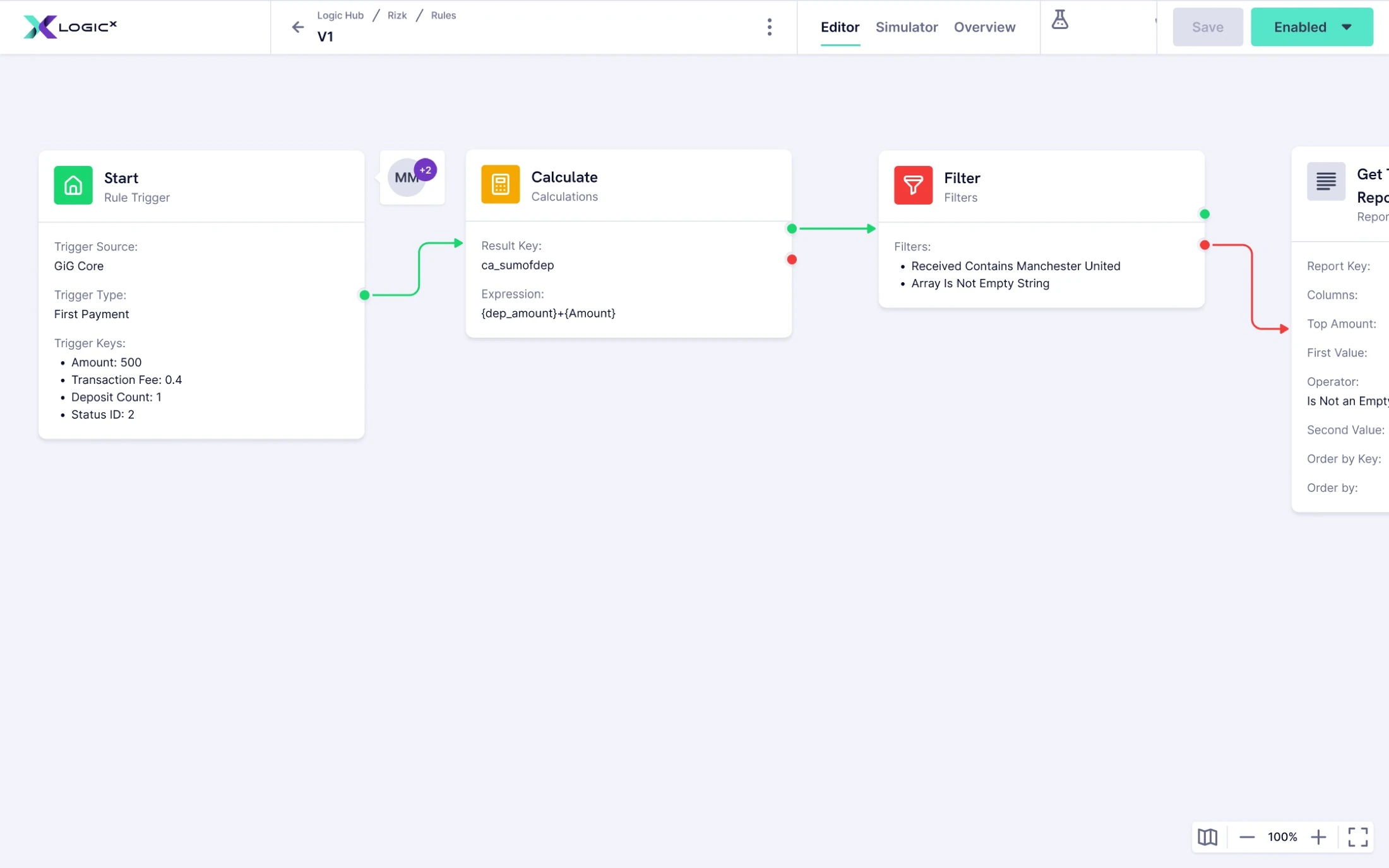
I was the main Product Designer behind the redesign and evolution of Logic, now LogicX, GiG’s real-time rules engine. Over several years, I worked with Product and Engineering to make complex automation more understandable for casino operators, from the rule editor to setup, simulation and integrations.
- Period
- 2021–2026
- Role
- Junior to Senior Product Designer
- Scope
- End-to-end UX/UI, interaction design, systems, prototyping
- With
- Product Owner, Engineering Manager and development team
- The problem
- Casino operators needed powerful automation without having to think like programmers.
- My contribution
- Redesign the editor, separate configuration from the rule, and put guidance at the point of decision.
- The change
- More help and clearer setup made creating rules and configuring blocks easier in day-to-day use; this was observed, not a measured uplift.
 The case in briefWatch the overview0:41
Powerful technology. A difficult product.
Automation without the development cycle.
LogicX lets operators combine triggers, conditions and actions into automated flows that react to events as they happen. The same engine can support player behaviour, bonuses, fraud prevention, responsible gaming, marketing and operational work.
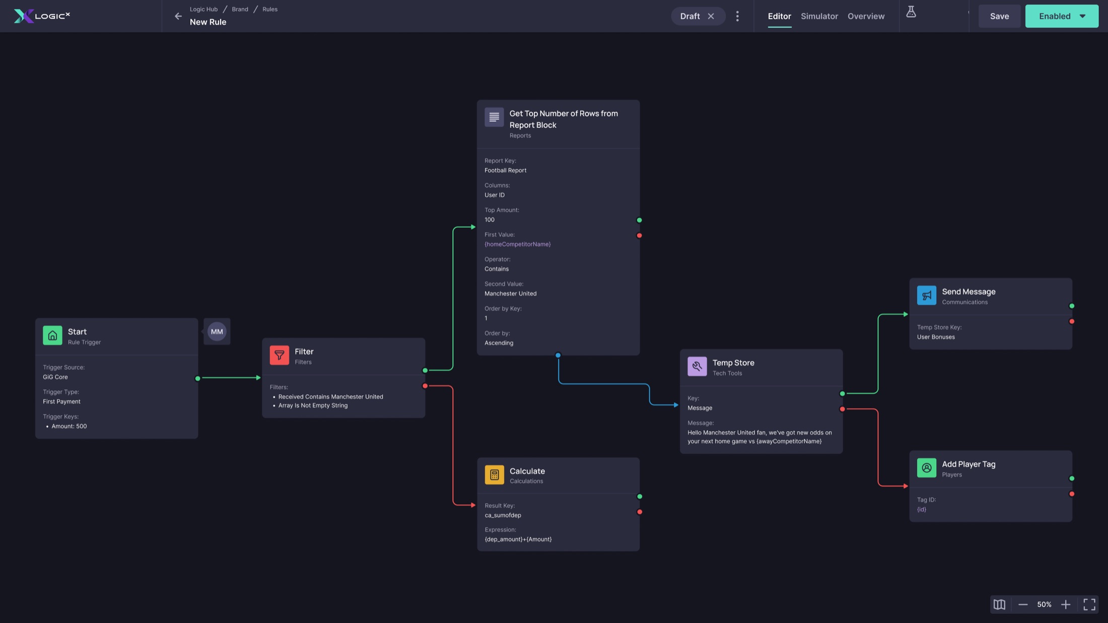
The principal users were semi-technical casino operators: confident with complex software, but not programmers. Developers also used the product. Less technical users often needed support to configure it.
Logic had grown from a technical internal tool. Its interface reflected the system underneath it: a steep learning curve, inconsistent patterns and flows shaped more by implementation needs than by how people understood the task.
A recurring debate was how much technical information to expose and how much flexibility to offer. Engineering needed to support advanced use cases; I pushed for an experience ordinary operators could follow without losing that power.
Make the simple things feel simple, while keeping complex things possible.
Separate the rule from its configuration.
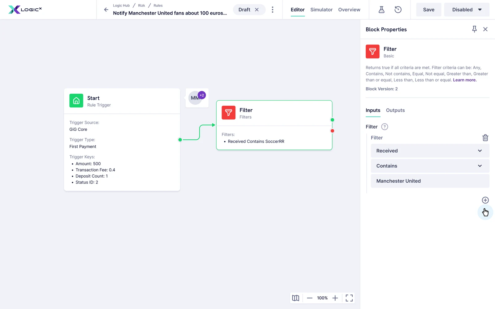
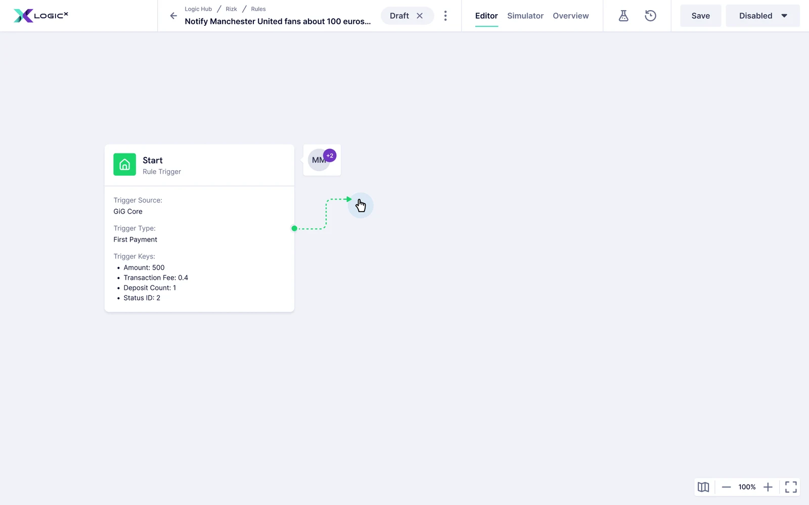
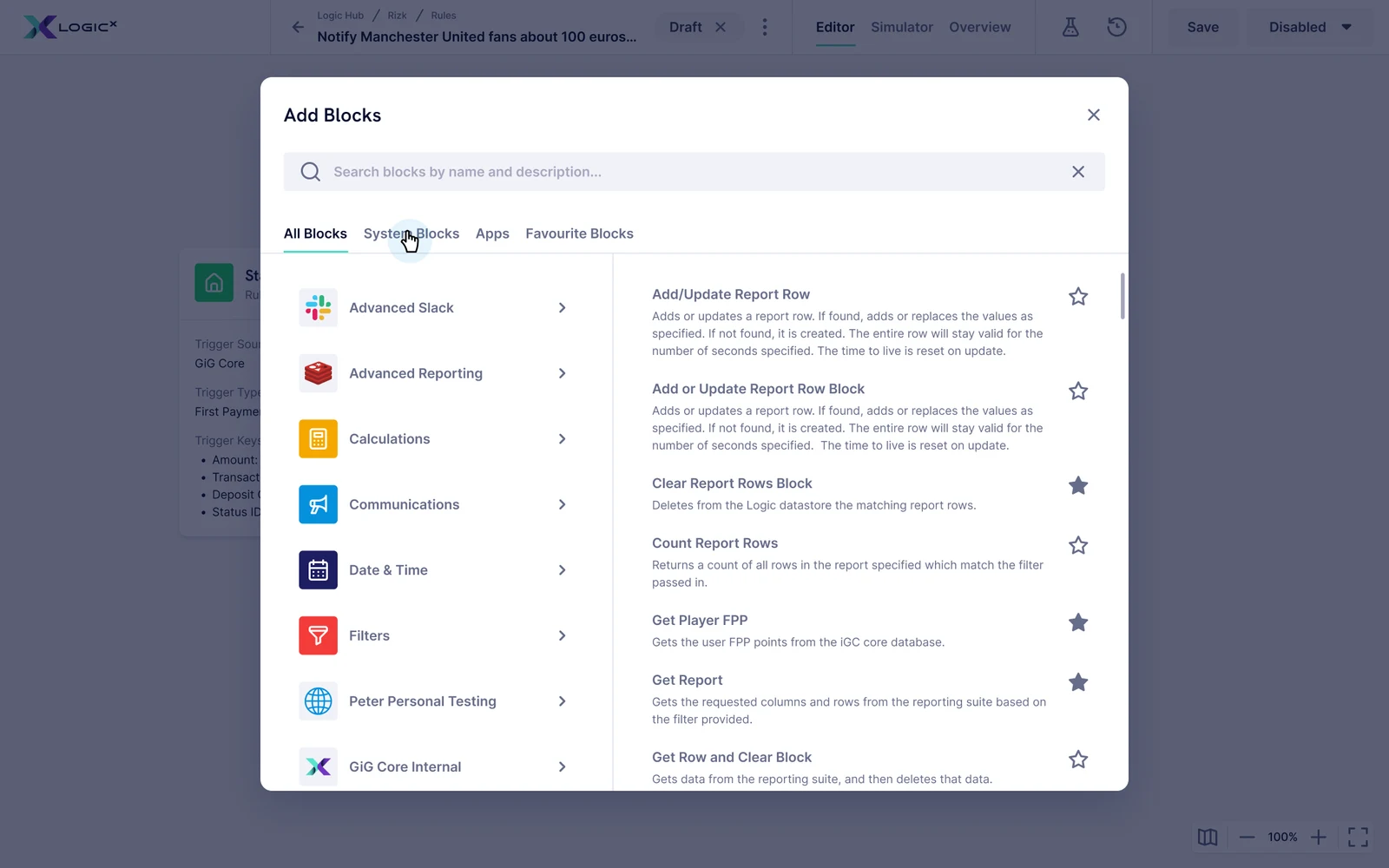
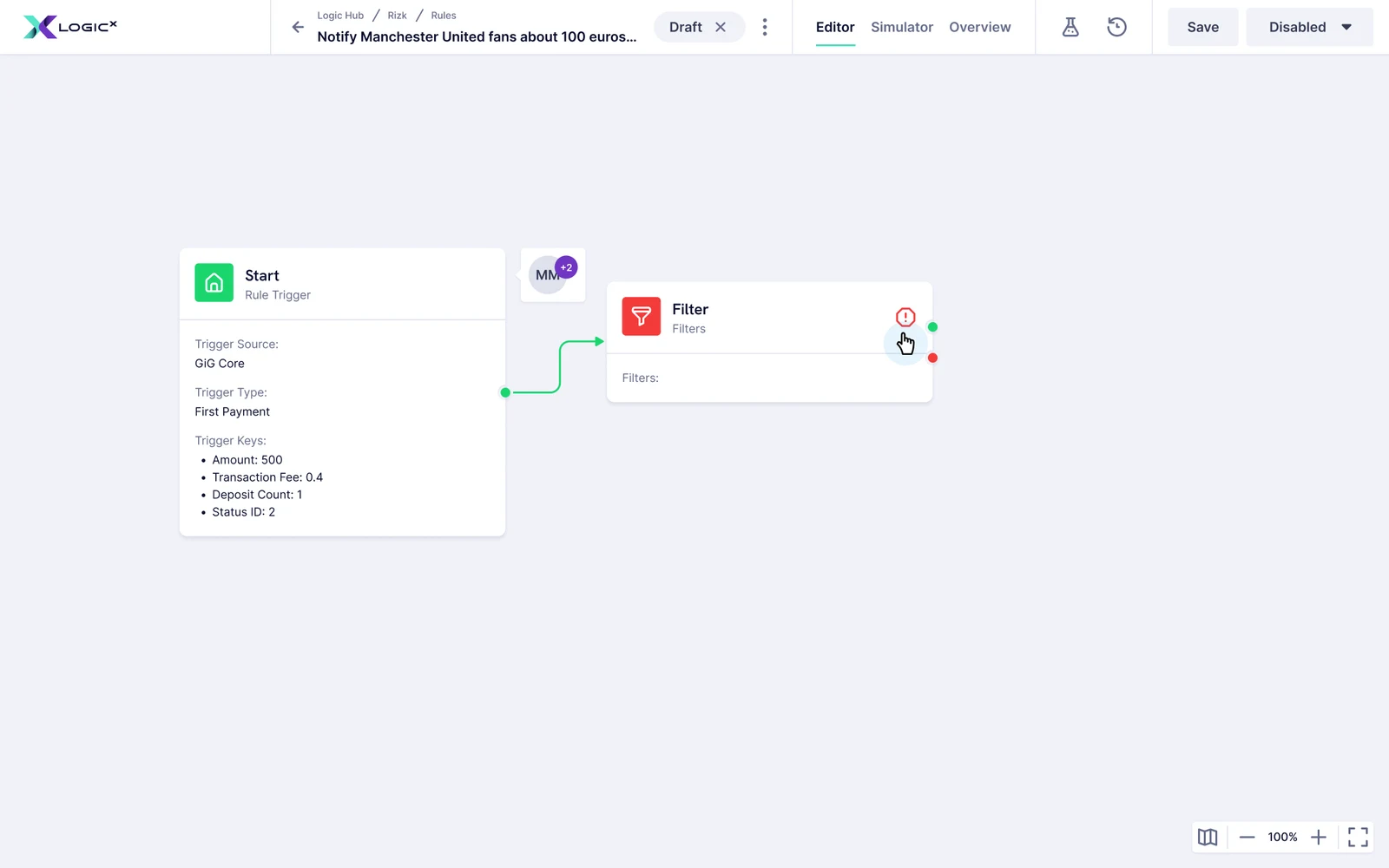
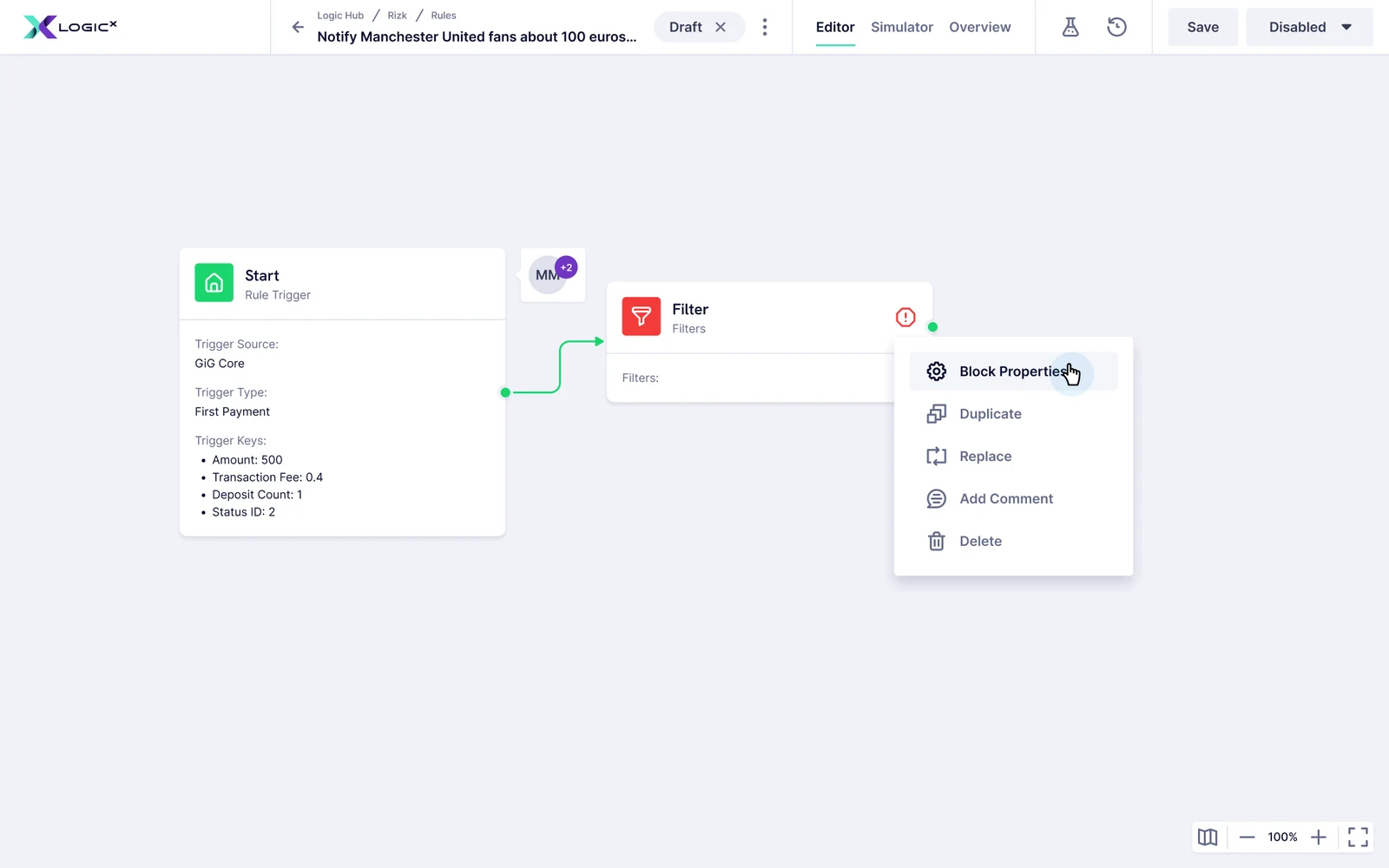
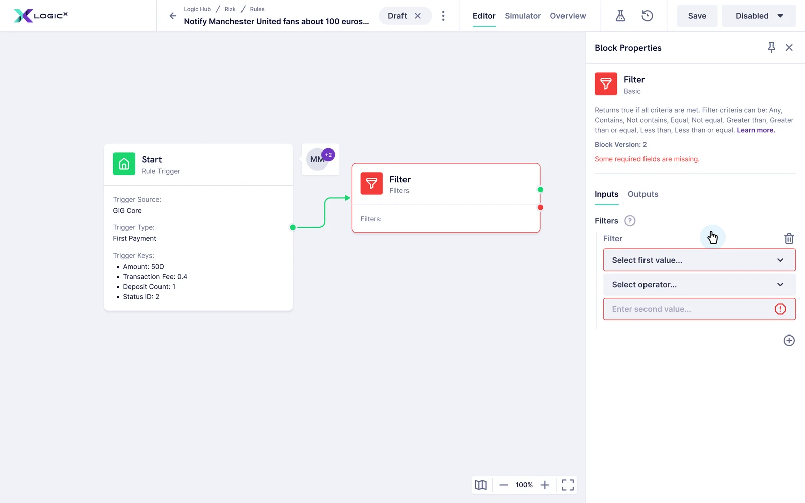
I redesigned the visual rule editor around a clearer hierarchy. The canvas needed to show the structure of an automation at a glance; detailed node configuration needed to remain accessible without breaking that overview.
Block designs went through several revisions, as did the rule cards. The recurring question was what someone needed to understand now, and what could wait until they opened the detail. This was an ongoing product decision, not a single visual refresh.
Received Contains Manchester United
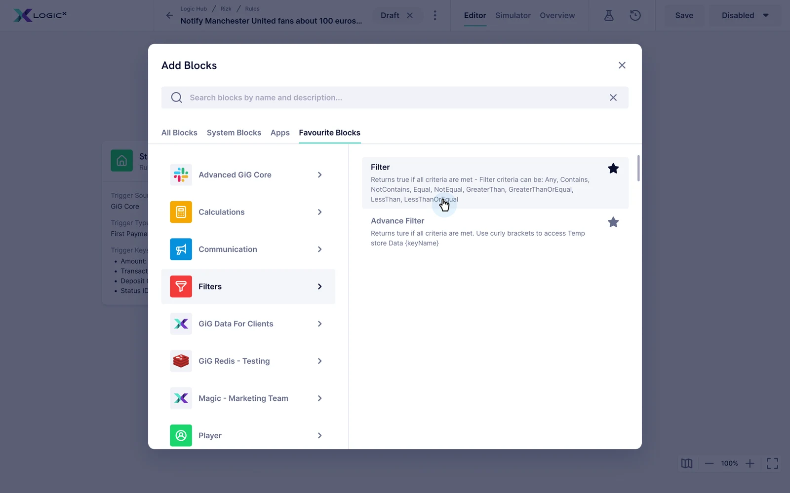
Returns true if all criteria are met. Filter criteria can be: Contains, Not contains, Equal, Not equal, Greater than or Less than.
Block Version: 2
A selected block keeps its configuration beside the rule.Reconstructed from the product design.
Design-screen walkthrough
The configured value is reflected in the block.
Put the explanation where the decision happens.
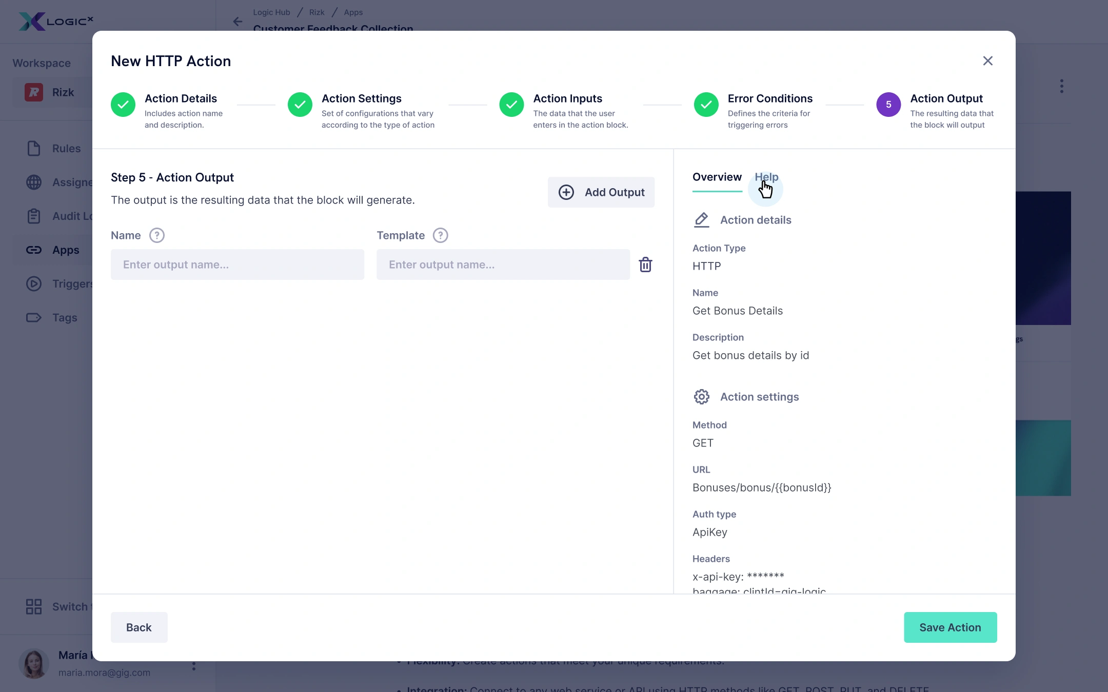
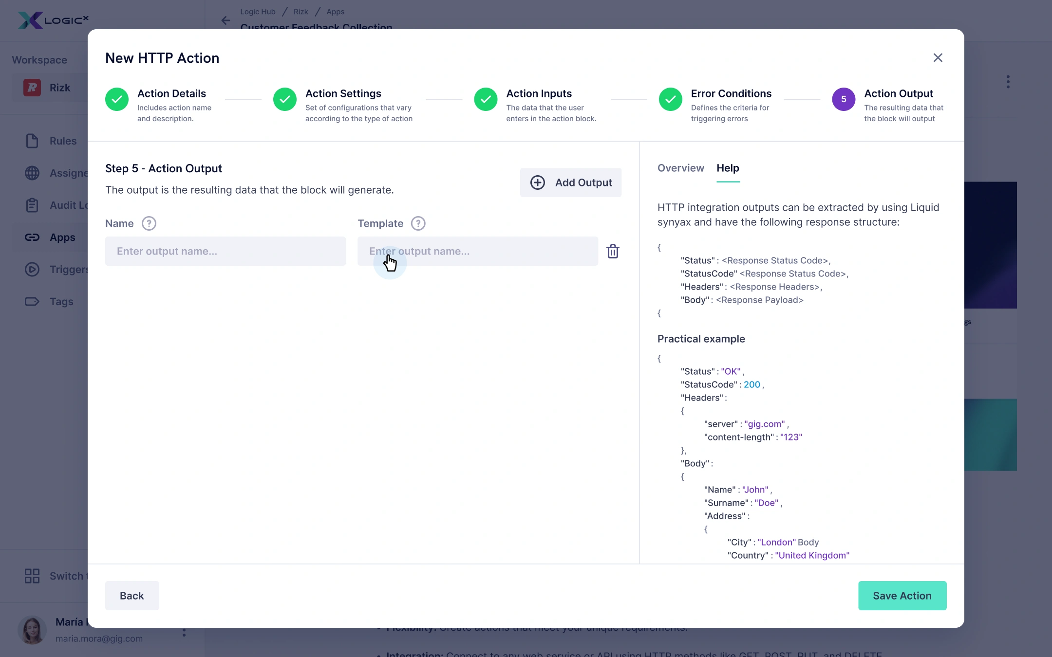
I added more contextual help, tooltips and short tutorials across the product, including inside setup wizards. Operators should not have to leave a task just to understand what a field or an unfamiliar concept means.
This was my response to the tension between expert flexibility and everyday comprehension: keep the capability, but offer guidance at the point of use. The wizard’s overview and help panels let someone check their configuration or get an explanation without losing their place.
Make the behaviour inspectable.
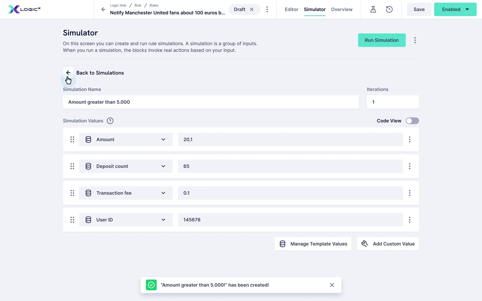
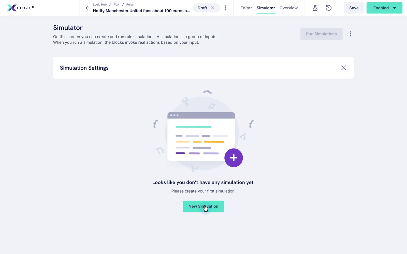
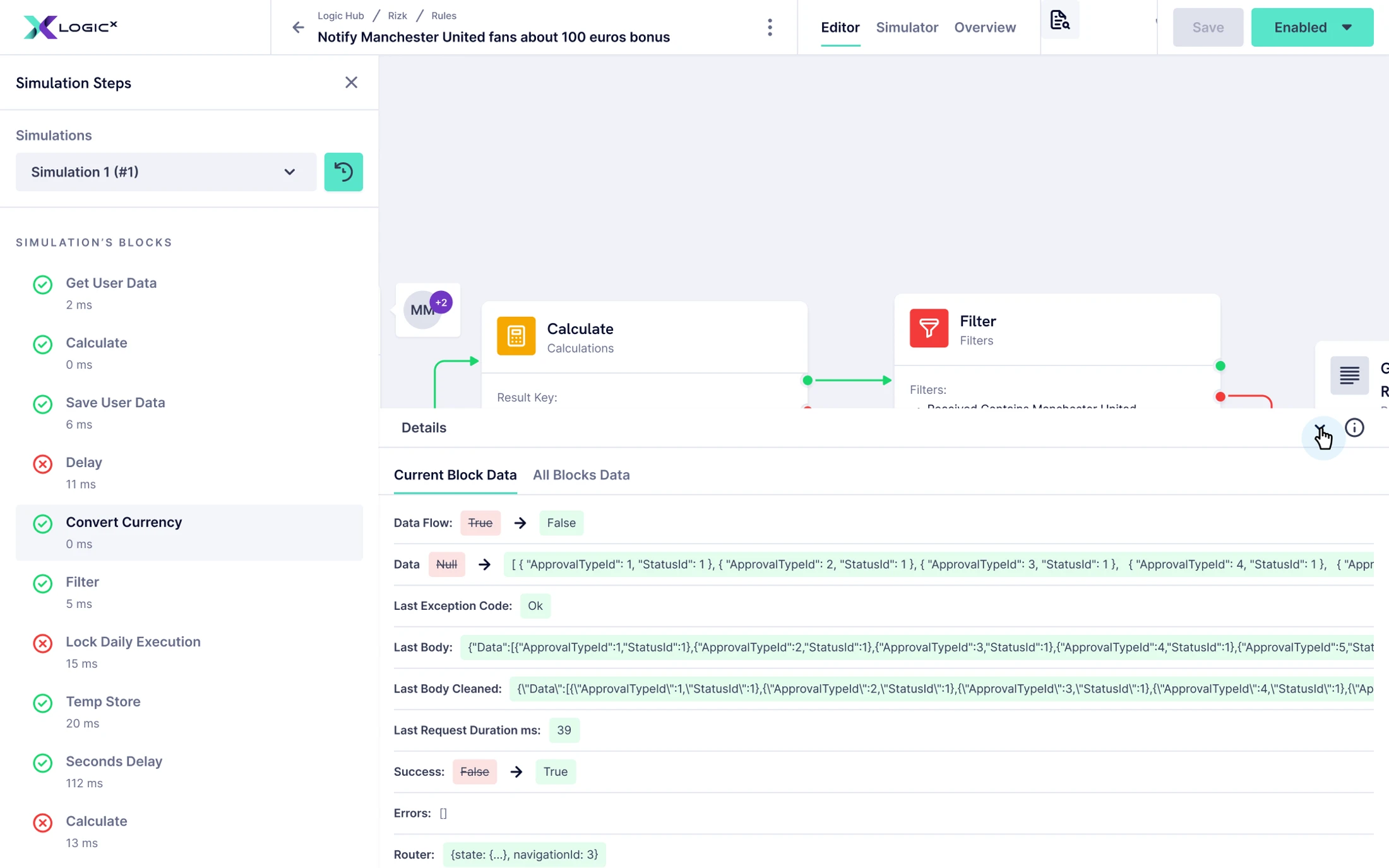
A rule can look connected and still be difficult to reason about. The simulator gave users a way to supply values and inspect how a rule resolved, including its different paths and iterations.
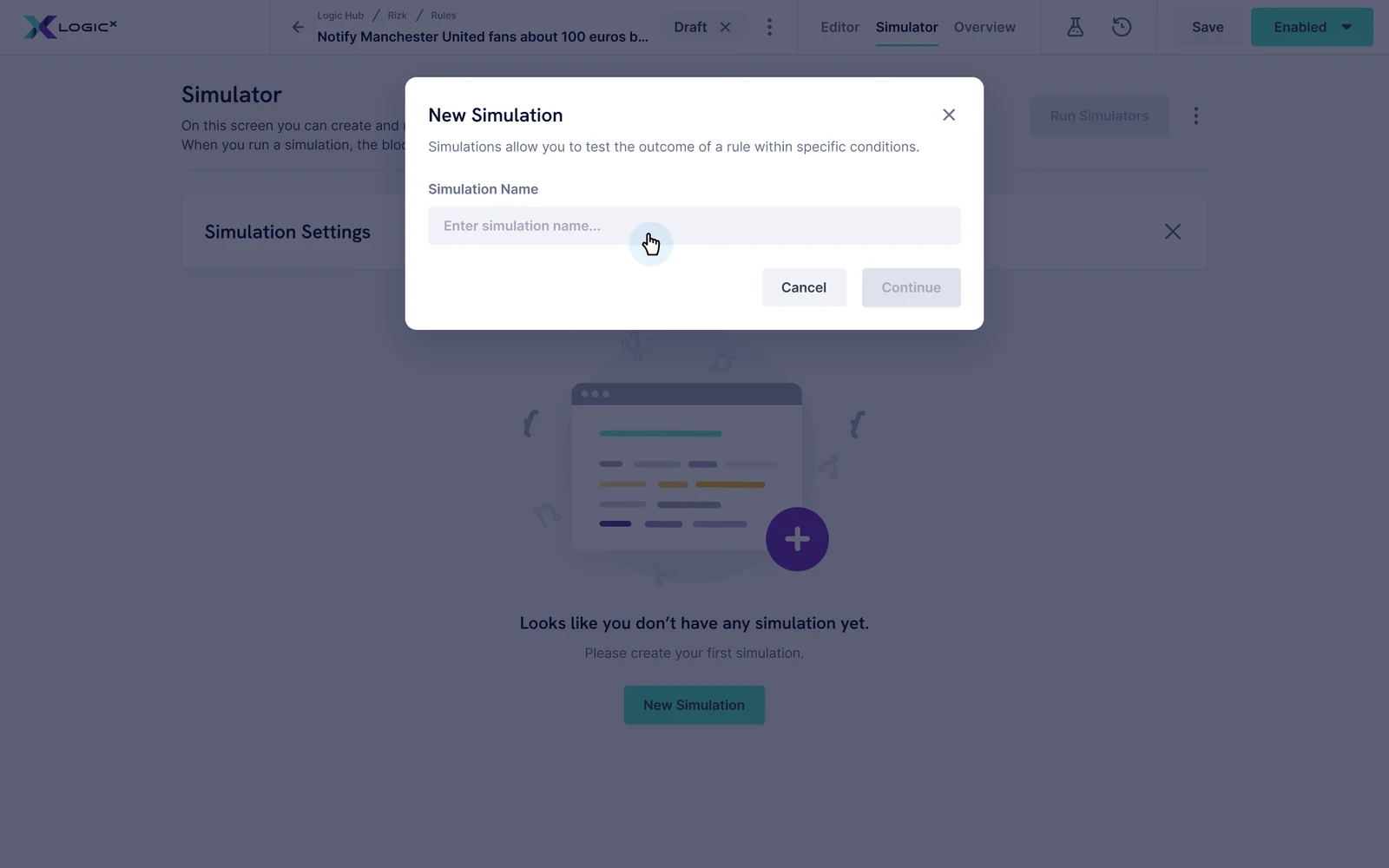
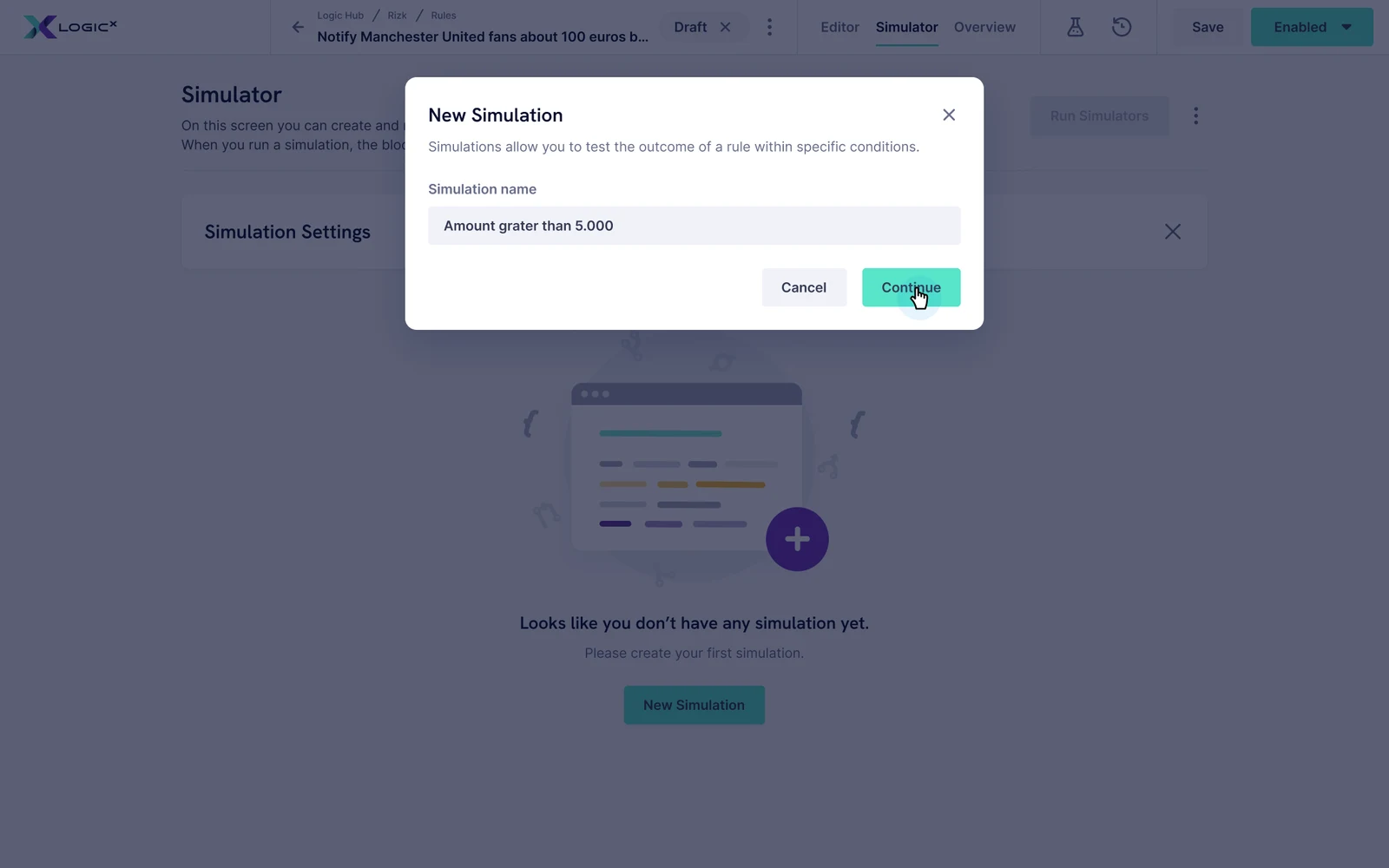
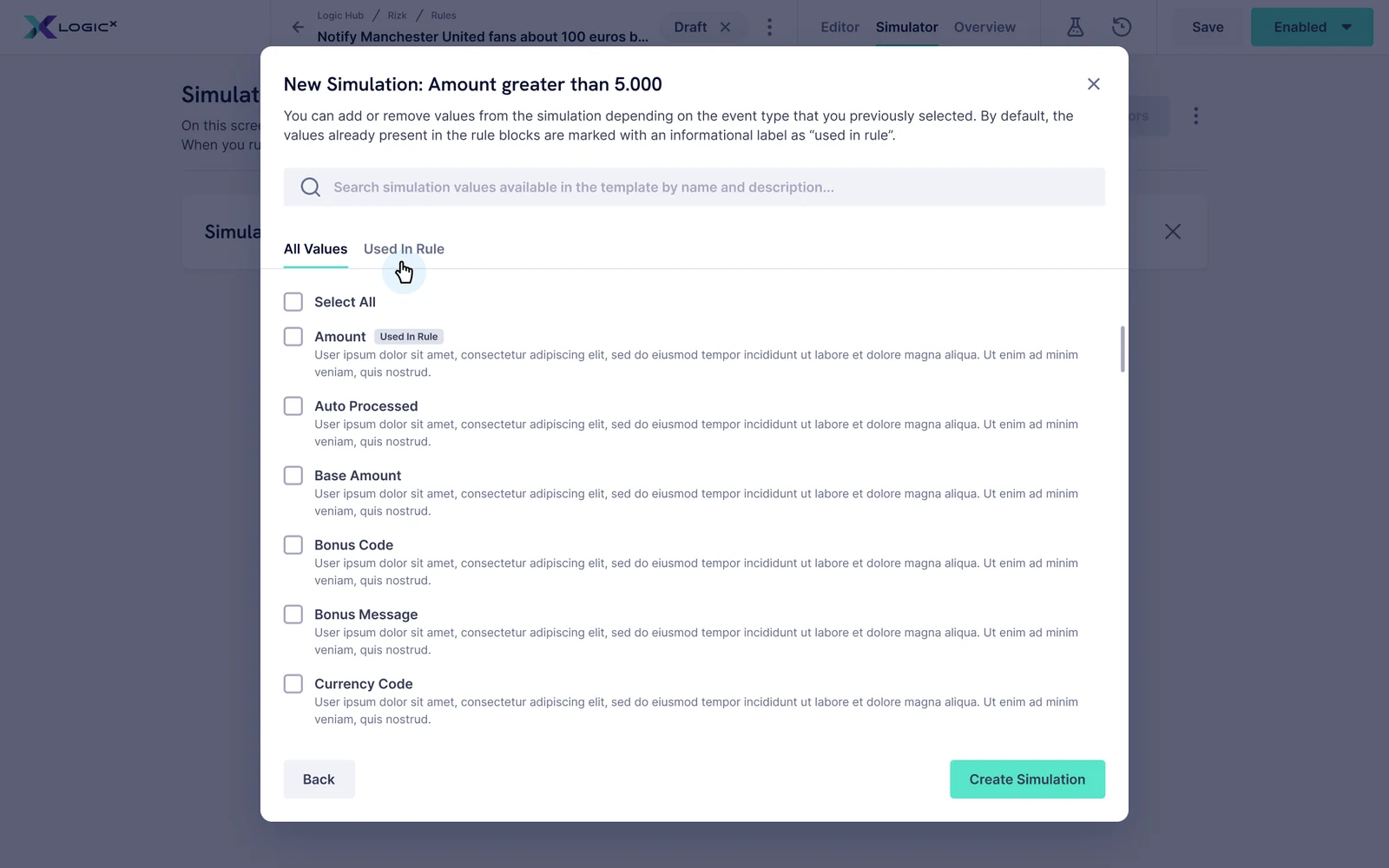
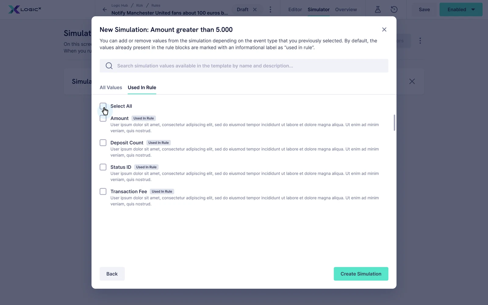
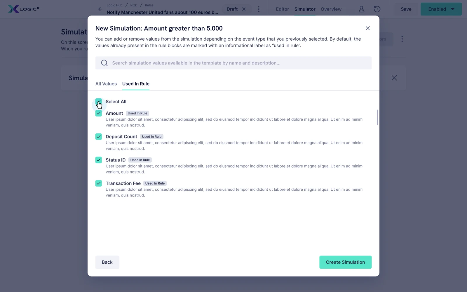
The setup needed its own hierarchy: start with a named scenario, find the values relevant to the rule, then configure the inputs. The interface brings those choices into a visible sequence rather than leaving them as an undifferentiated technical form.
Simulation can invoke real actions, so inputs need to be reviewed before running.
Design-screen walkthrough
Review and edit the inputs before running the simulation.
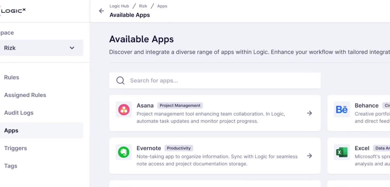
Apps extend the rule builder into a connected product ecosystem.
A product within a wider system.
Logic also needed to feel part of GiG’s backoffice ecosystem. I worked on Logic and on the Figma side of the shared Backoffice Design System, so patterns could move in both directions: reuse the system where it fit, and extend it when Logic exposed a genuine gap.
As the product grew, I designed setup wizards, templates, apps and connector experiences. These were developed through close iteration with Product and Engineering, with customer feedback usually arriving through Product and occasional direct user conversations.
Explore the Backoffice Design SystemAnother way to ask for help.
I also explored GiG Assistant as a contextual support layer, bringing help into the rule-building experience.
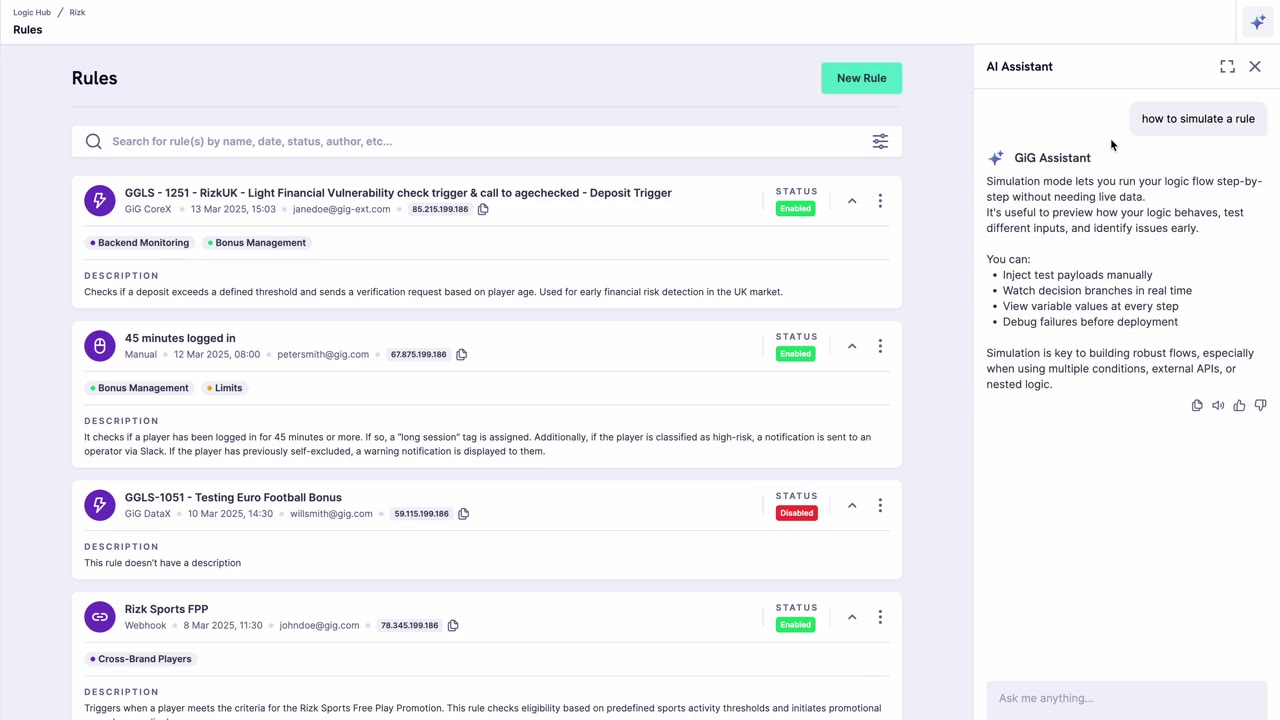
GiG Assistant · Exploratory prototype, beside the rules it helps with.
What this work changed in my practice.
My contribution was the experience layer: a clearer editor, more structured setup and contextual guidance across an evolving product. In my experience, the extra help made creating rules and configuring blocks easier.
The hardest part was understanding the system deeply enough to decide what to expose. I learned that simplification is not always removing a feature. Sometimes it is making the next decision understandable, while leaving the advanced option within reach.
Power and usability are not opposites. The design work is finding a way for both to coexist.