Case study / B2B ecosystem
Backoffice Design System
Building one product language across a complex ecosystem.
From 2021 to 2025, I built and maintained the Figma system behind five GiG backoffice products. The challenge was not to make every screen identical, but to give different teams a dependable shared language for real production work.
- Period
- 2021–2025
- Role
- Junior to Senior Product Designer
- Scope
- System architecture, components, variables, governance, design-to-code alignment, cross-team workshops
- With
- Design, Product and Engineering across the backoffice ecosystem
- The problem
- Five backoffice products needed consistent foundations without losing their specialist workflows.
- My contribution
- Reconstruct the code-based UI kit in Figma, run the shared library and its rules, and connect five teams that rarely talked to each other.
- The change
- A shared design source for Core, CoreX, Magic, LogicX and GiG Trader, used by around seven designers and more than twenty developers.
 The case in briefWatch the overview0:49
Start with what was already shipping.
When I joined GiG in 2021, the backoffice already had a code-based UI kit built on Bootstrap 4.6. Figma had only a small library. Designers needed a reliable source that reflected what Engineering could actually build.
I reconstructed the existing kit in Figma, then developed components as product needs emerged. Controls, tables, navigation, forms and states had to capture behaviour as well as appearance. This was a working production library, not a speculative redesign.
Consistency without sameness.
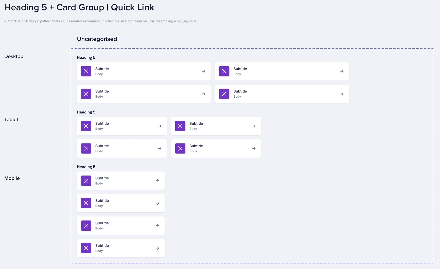
Core, CoreX, Magic, LogicX and GiG Trader shared the library, but not the same workflows. Account operations, content management, rule building and trading each needed their own interaction patterns.
I used atomic design to organise the system from foundations to complete patterns. The important decision was where reuse stopped: share the familiar building blocks, but preserve specialist behaviour when a product genuinely needs it.
- Core
- Account operations
- CoreX
- Platform operations
- Magic
- Content management
- LogicX
- Rules & automation
- GiG Trader
- Trading workflows
- Foundations — typography, colour, spacing and states
- Shared patterns — fields, tables, navigation and overlays
- Product-specific patterns — specialist behaviour, not arbitrary variation
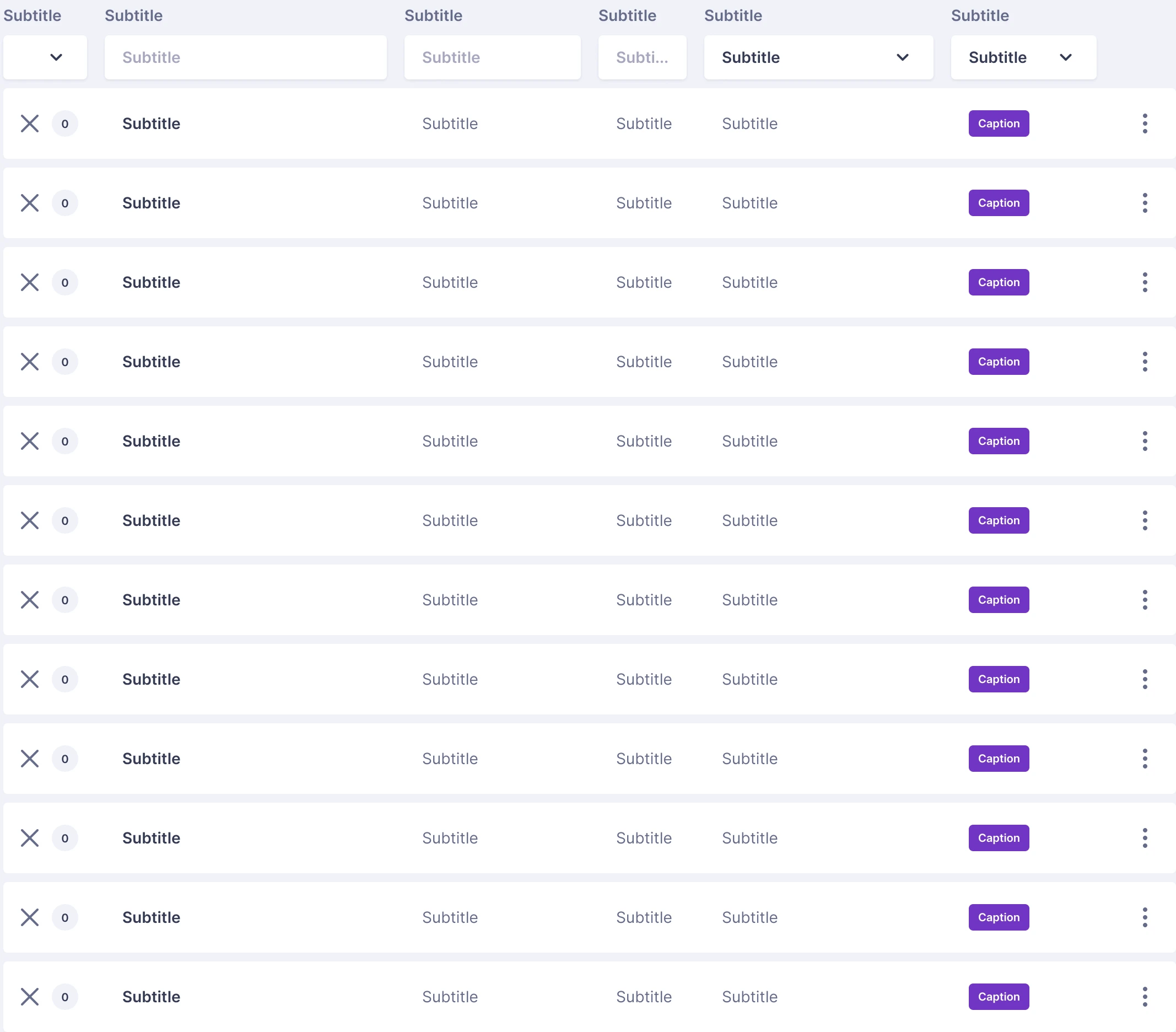
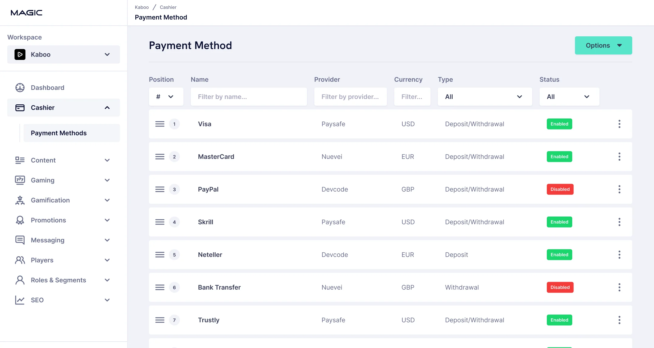
Atom / Table Cell One cell type, here a status badge. A single set of 54 variants covers every cell the tables need.
Molecule / Table Column A heading and its filter over a stack of cells of one type.
Organism / Payment Method table Columns assembled into one table, still holding placeholder content.
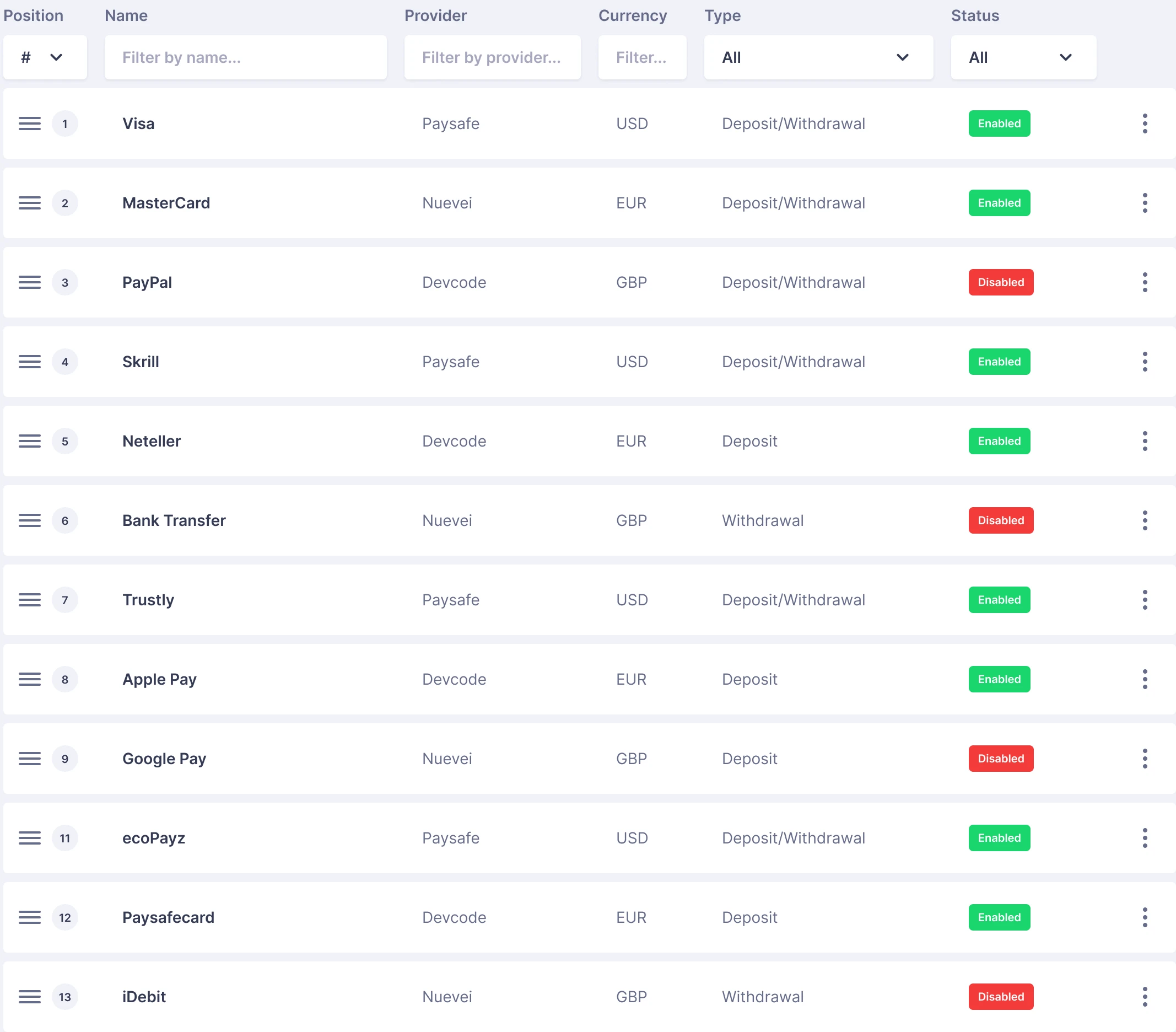
Template / Magic payment methods The same table with Magic’s real content: providers, currencies, types and status.
Used by two or more products? Make it shared.Working rule from the library guidelines
A small rule with a large consequence.
The library guidelines made the boundary explicit: when two or more products needed the same pattern, with the same behaviour, it belonged to the shared ‘All’ variant. Product-specific variants stayed available when behaviour genuinely differed.
Requests came from designers, product owners and front-end leads, usually in the middle of product work. Each one went through the same checks before anything was drawn: does something already do this, how many products would use it, what would change for the screens already built on the old version, and could Engineering build it from the existing UI kit. Most requests ended as a new variant or property of an existing component; a few became new components.
Exceptions were allowed, but named, so they stayed visible until they could be retired.
The contribution rule
One product keeps it. A second moves it to All.
| Component | Platform | Magic | Logic | Library variant |
|---|---|---|---|---|
| Card | Payment Method | Not used | Used | Used | All |
| Card | Rules | Not used | Not used | Used | Logic |
| Modal | Confirmation | Used | Not used | Used | All |
| Card | SEO Entry | Not used | Used | Not used | Magic |
From request to release
The same four questions, every time.
- 01Does it already exist?
Search the library first.
- 02Who else needs it?
Two or more products: it goes to All.
- 03What would it change?
Check the screens built on the current version.
- 04Can the code support it?
Confirm with the front-end lead.
Three possible answers
- Extend
A variant or property on an existing component.
Most requests - Share
A new component in All, for every product.
- Keep local
A new component in one product, until a second needs it.
One exception, end to end
Allowed, but named.
- 01 · Request
“We need the old and the new shadows side by side while we migrate.”
Old and new shadows, side by sideCoreX’s product owner and front-end lead needed both styles while they migrated. The product was still called Endeavour.
- 02 · Decision
Atom Extended shadows (Endeavour)Temporary
A named, temporary atomNot a quiet one-off in their files: an atom in the library, labelled with the team that needed it.
- 03 · Release
Added Atom: Extended shadows (Endeavour)Changed Atom: Shadow, new default colour
Logged where everyone looksShipped with a changelog entry, so every team could see the exception and that it was meant to go.
Separate colour from its job.
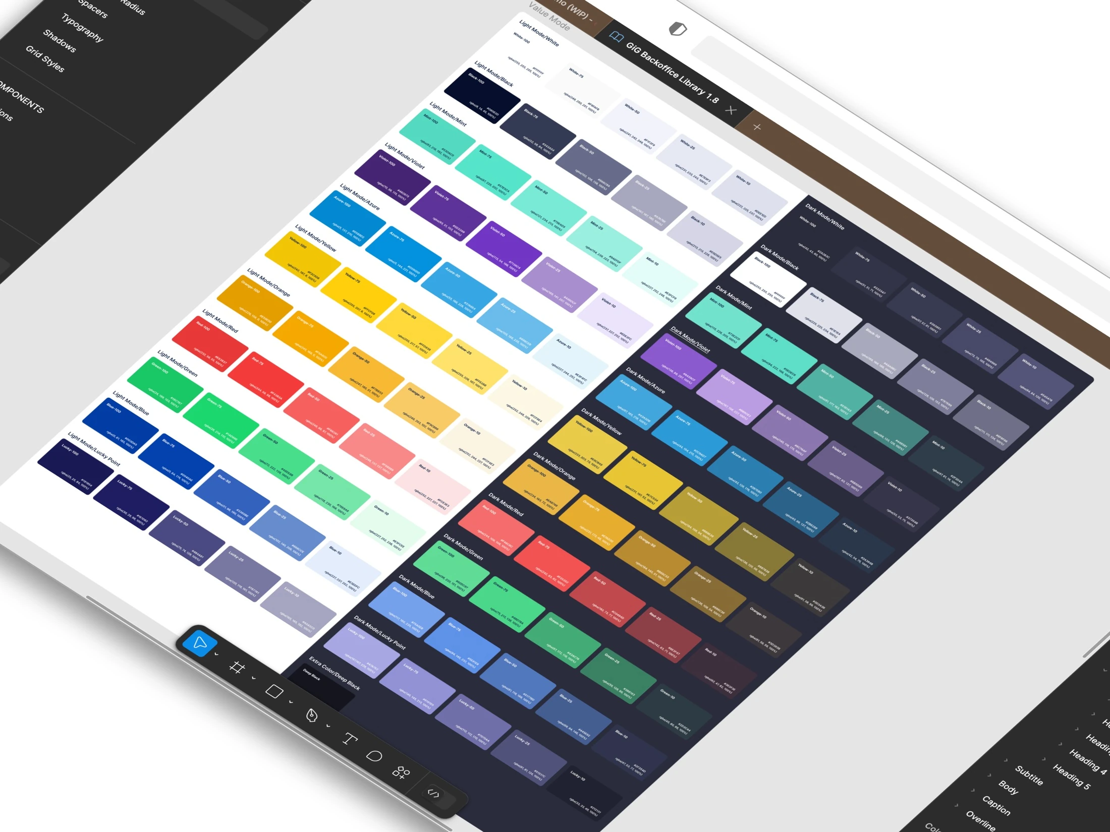
The same split between what is shared and what is specific applied to the foundations, starting with colour. As Figma’s capabilities evolved, I moved colour towards a primitive-to-semantic variable architecture. A component could reference what a colour does—surface, text or feedback—instead of a fixed value.
The file contains 184 primitive colours and 84 semantic variables, each with a light and a dark value. Those foundations let the interface change appearance without changing its underlying structure.
- Primitive colours
- 184
- Semantic variables
- 84
- Modes, light and dark
- 2
One value, followed into a product
Where a colour decision actually ends up.
- 01 · PrimitiveA value.100Green-75#1AD66E50
#1AD66E is one step of the green scale: a colour, with no meaning yet.
- 02 · SemanticA role.
successLight#1AD66EDark#4BD78AThe semantic variable success gives it a job: positive actions, badges and callouts. In dark mode the same role resolves to #4BD78A.
- 03 · CodeA shared name.
/* handed to Engineering */ --color-success --color-success-accent --color-success-softThe role reached Engineering under the same name, as a CSS custom property, with its accent and soft companions beside it.
- 04 · ComponentA component.
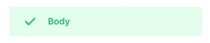
The Success callout uses the role for its icon and text, on the softer success-soft ground.
- 05 · ProductA product.
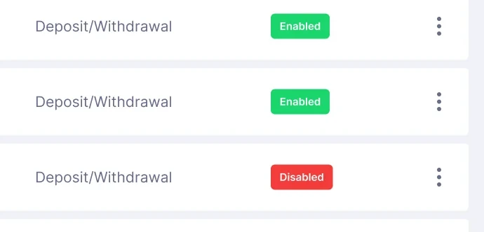
In Magic’s payment methods, the Enabled badge carries the same value.
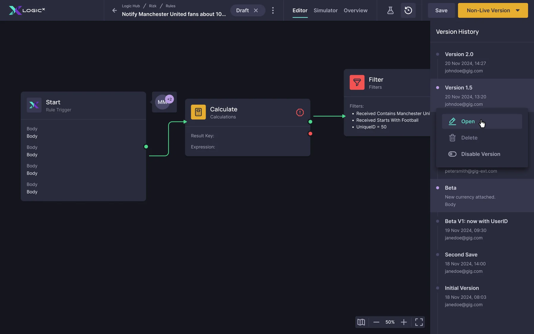
The destination was production, not Figma.
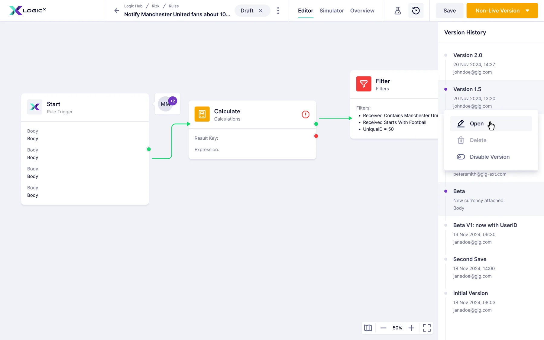
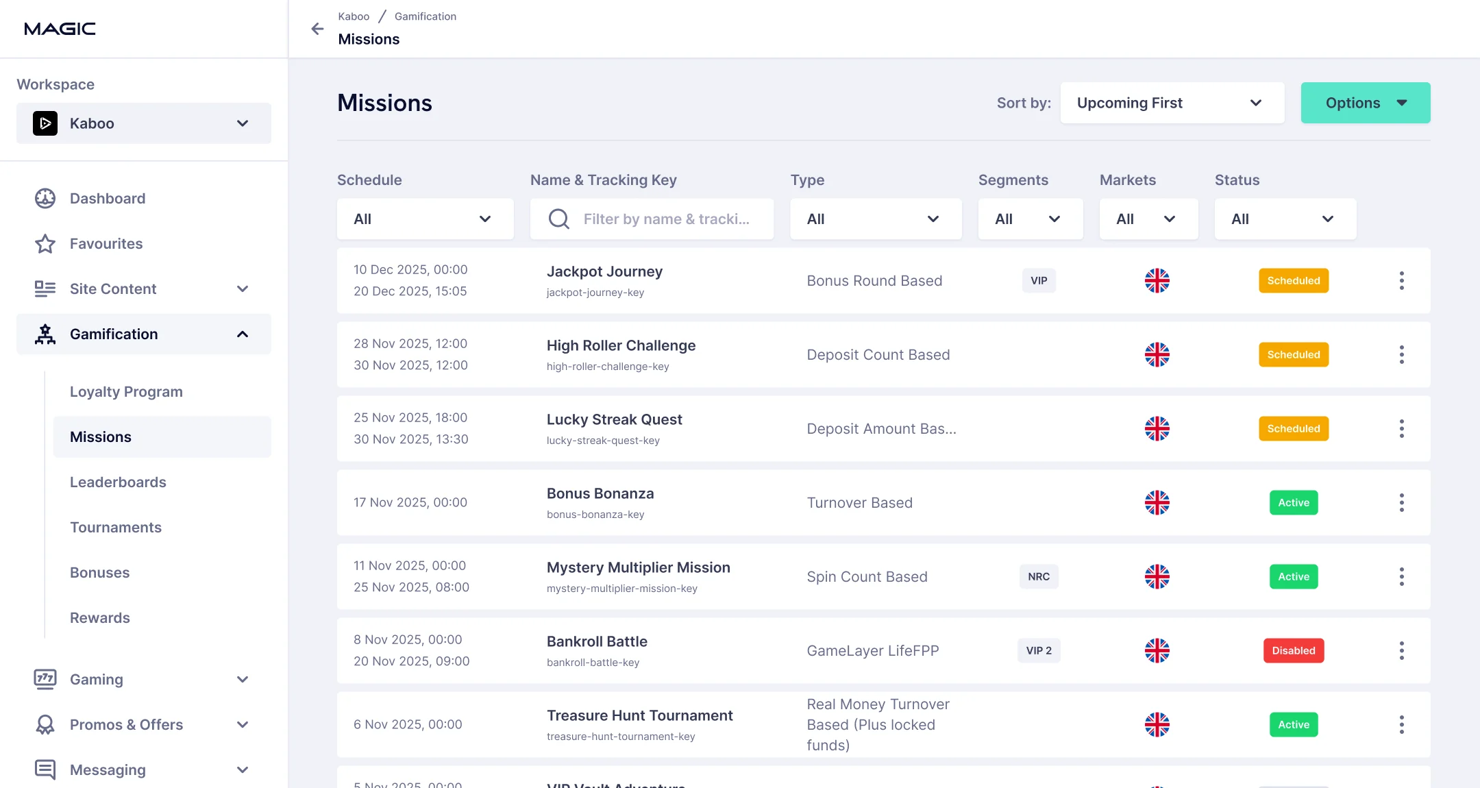
The components represented shipped work: they either came from the existing UI kit or were created for something a product needed. The system became a shared design source across five backoffice products, with common patterns and room for specialised workflows.
Around seven designers, more than twenty developers and three or four product owners worked from it. That audience shaped the documentation: designers needed the rules, developers needed names and states they could map to code, and product owners needed to see what already existed before asking for something new.
- 01Navigation
- 02Page actions
- 03Filters
- 04Status
A library built through product work.
Scale of the Figma library, recorded in a file audit.
- 5,242
- components
- organised into 323 component sets
- 77,347
- instances
- reused throughout the file
- 281
- variables
- including 84 semantic variables, in light and dark
The bridge between five teams.
Keeping five products on one library was as much about people as about files. I ran it like a product, with numbered releases and code as the reference, but the harder part sat between the teams.
We shared the Figma library, but not the code. Four products still built on the old Bootstrap 4.6 UI kit, while CoreX had written its own React library with custom CSS, based on the design system. Working on all five products gave me a view no single team had: the teams worked in silos and rarely knew what the others were building, so I became the connection. I knew who to ask, pointed teams to work that already existed and, when it mattered, put them in the same room.
I organised workshops where the teams compared how they built their front ends. CoreX’s library was the most modern and the closest to the system, so the teams agreed to migrate the old UI kit to it step by step, and the 2.0 was planned around it.
Between the teams
From five silos to one shared base.
- 1One Figma library, but four teams on the old Bootstrap kit and CoreX on its own React library.
- 2Working on all five, I knew who to ask and who to connect.
- 3Workshops: CoreX’s library became the shared base, with the old kit migrating to it.
NextStarted in 2025, not shippedDashed marks what was planned
Version 2.0: for people and AI tools.
The workshops settled where the code would go. The Figma library needed its own rebuild: by 2025 it showed its age. It was built before component properties and variable modes matured, so its components had grown by multiplication: the Input alone had 98 variants.
The 2.0 had two aims: a leaner library for designers, and one that AI tools could read as reliably as people. That meant properties instead of variant combinations, names that say what a token or component is for, a description and usage notes on every component, and a direct link to the coded components the teams had agreed to share.
I used AI tools for the repetitive part, rebuilding components and drafting their documentation, and reviewed every result by hand. When an agent merged the Button’s Hovered and Pressed states because their fills matched, I kept them apart: code treats them as different interactions, and some categories change the label when pressed. The core components reached their 2.0 version; the work stopped before it was rolled out to the products.
Input, 1.x to 2.0
Same input, a seventh of the variants.
1.x · Shipped
98 variants
2 surfaces × 7 types × 7 states
Open the real 1.x Input set- ÷ 2Surfacebecomes a variable mode: the input reads its ground from the page or the widget
- ÷ 3.5Seven typesbecomes two kinds and four booleans
2.0 · Reconstructed approach
14 variants
2 kinds × 7 states, plus properties
- + Leading icon · boolean
- + Suffix text · boolean
- + Clear button · boolean
- + Icon group · boolean
- + Surface · variable mode
The plan for 2.0
One source, read by people, code and AI tools.
Agreed in the workshops as the shared base.
Library 2.0
- StartedComponents on properties
Properties instead of one variant per combination.
- StartedDescriptions and usage notes
On every component, drafted with AI, reviewed by hand.
- PlannedNames that say what they are for
Tokens and properties a tool can read.
Planned connections
- Code ConnectCoded UI Kit
Each component linked to its coded twin.
- MCPAI tools
Structured docs an assistant can read.
- DocsDesigners and developers
Component, rules and code in one place.
Judge a system by the decisions it makes easier.
Not by how many components it contains. The parts of this work I would repeat are the small rules that saved arguments, the exceptions that stayed visible, and the conversations between teams that nobody else was set up to start.
The shipped library carried four years of real production, and the limits of the Figma it was built in. The 2.0 was meant to answer those limits; it was never rolled out.
Consistency is not making everything the same. It is giving different products the same rules.