Casino Customizer
From a live demo to a usable handoff.
I designed an interactive Figma prototype that helped Sales show the product and clients choose their own direction. I then extended the experience with a summary and a Save & Export Tool, turning those choices into a configuration the team could actually use.
- Period
- 2026
- Role
- Product design, prototyping and companion-tool build
- Scope
- Casino and Sportsbook configuration, client onboarding, decision handoff
- With
- Sales, Product and GiG / WAND teams
- The problem
- Agreeing a casino’s visual direction could take 1–3 weeks of proposals and revisions.
- My contribution
- An interactive Figma Customizer, a selection summary and a Lovable tool that made the configuration reusable.
- The change
- Clients sent a preferred configuration. Skinning then typically took 2–3 days after feedback, usually approved at the first review. Timings recalled from the workflow.
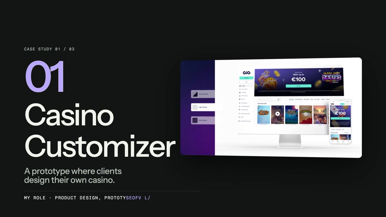 The case in briefWatch the overview0:41
The conversation needed something to point at.
Sales had an incomplete demo with an older visual identity, and updates depended on development capacity. At onboarding, clients often had to describe what they wanted before they really understood the available options.
For clients without a clear brand direction, we produced proposals in light, dark and hybrid modes, with several colour combinations. Each round created more back-and-forth. The problem was not a lack of options; it was a lack of a shared reference.
Make the choice visible, not abstract.
I built a working Figma prototype with configuration controls beside a live preview. Sales could tailor a demonstration in a meeting or at an event, while clients could explore the same experience on their own.
The first version made visual direction tangible: colours, ready-made themes, light, dark and hybrid modes, navigation and device previews. Clients returned screenshots or a simple preference such as “light mode, with red as the primary colour”. That was already more useful than another speculative proposal.
Start broad. Make the final choice precise.
Colour selection moved from a hue to a tonal scale with visible hex values. Instead of confronting clients with every possible value at once, I made the decision progressive: choose a family, refine a shade, then see it in the actual interface.
Templates offered a coherent starting point rather than a blank canvas. Light, dark and hybrid previews helped clients judge a combination in context, not just as a palette.
Version 2.0 went beyond the skin.
The next version added Sportsbook, lobby customisation and mobile navigation choices. Clients could inspect more of the experience they were commissioning, not just its colours.
I also created a separate Sweepstakes version. Alongside that wider scope, 2.0 introduced the final summary and a companion Save & Export Tool to make decisions easier to return to the team.
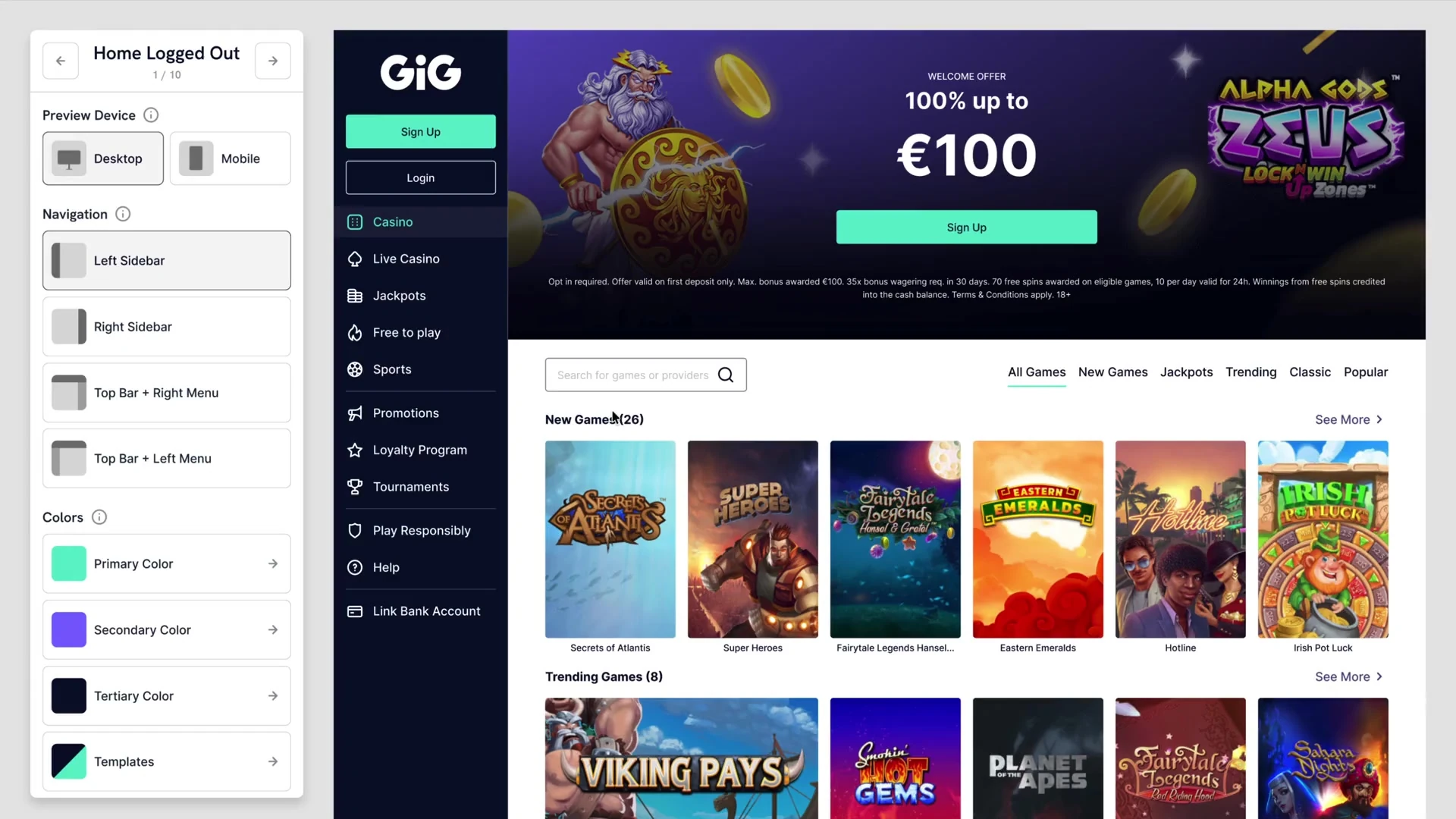
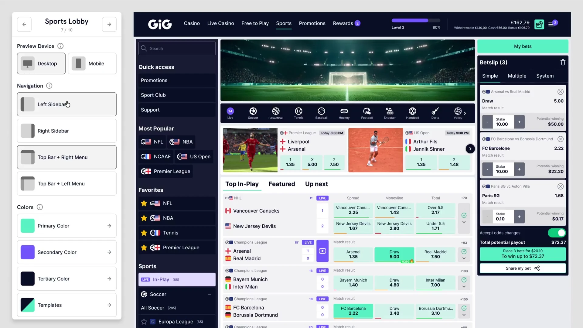
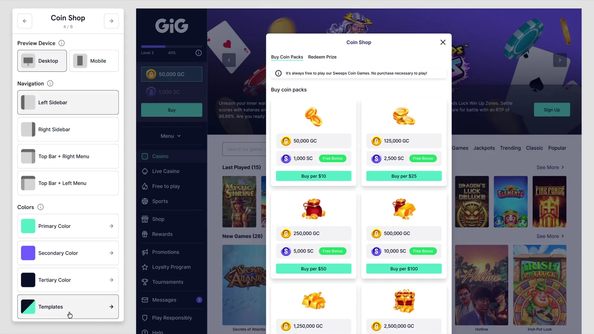
Configure the experience, not only its palette.
Carousel, categories, game thumbnails and secondary banners could be compared in the live lobby.
A simple choice.
A complex prototype.
To make the Customizer feel like a working application, I pushed Figma’s interactive variables and conditional actions beyond a sequence of linked screens. A choice had to update the interface, remain consistent across views and carry into the final summary.
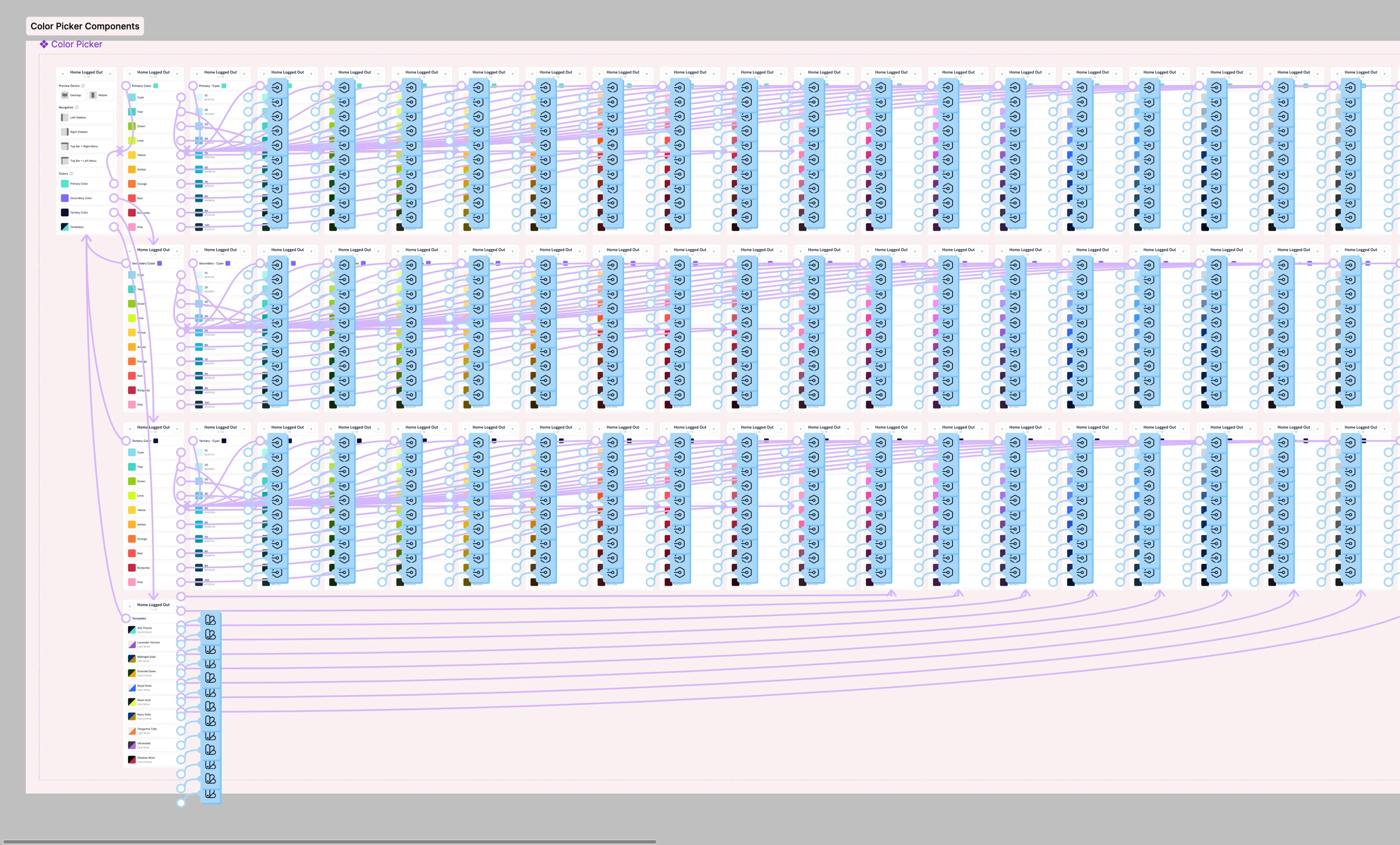
The state had to travel with the user.
I used variables and conditional logic to keep decisions connected. Components bundled the available lobby and navigation variants, showing or hiding them according to the selection instead of treating every combination as a separate static screen.
Switching to mobile could not reset that work. The prototype also had to represent the mobile navigation options while retaining the direction already chosen on desktop.
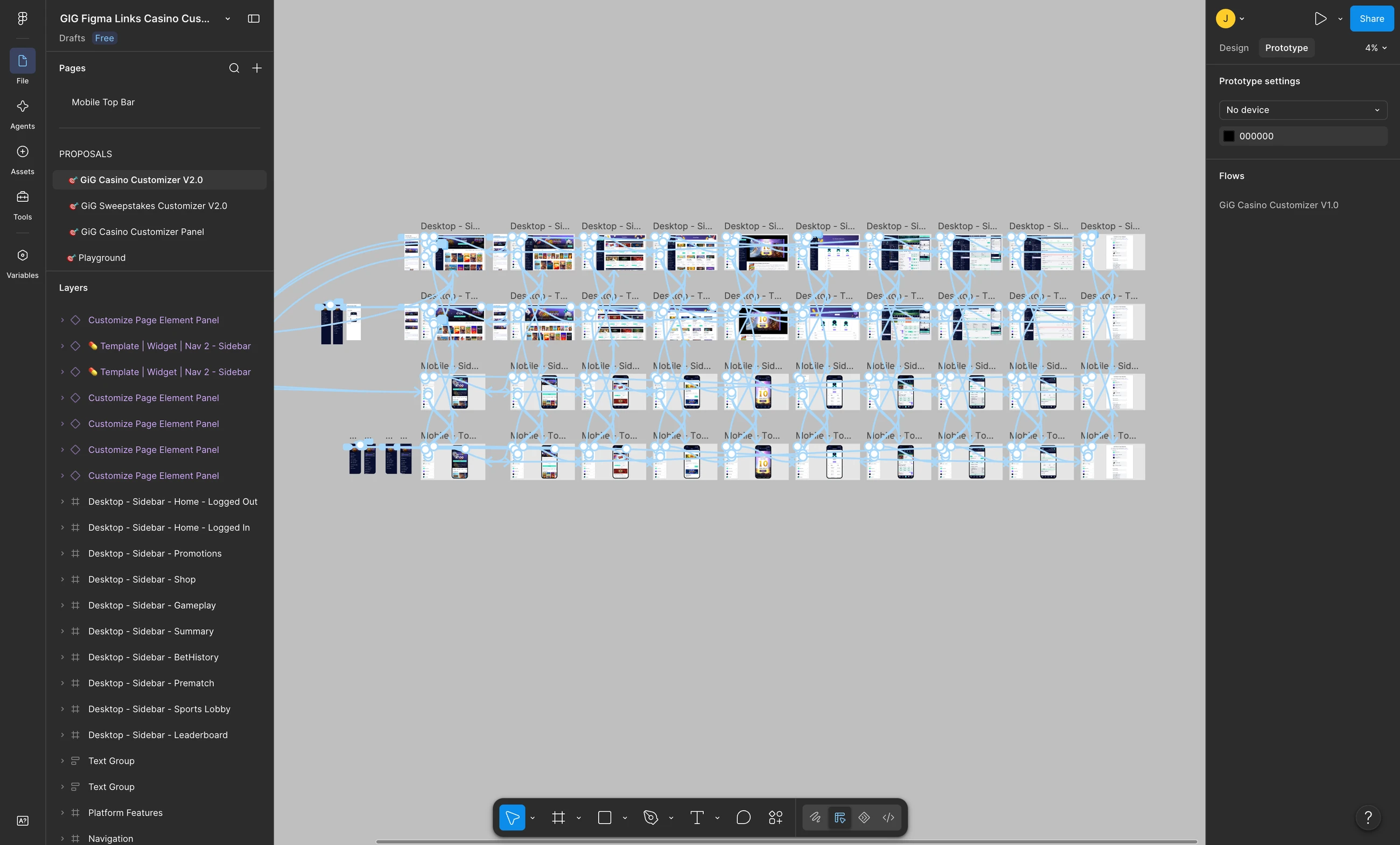
A prototype could show the choices. It could not save them.
That was the limit of Figma: clients could build a configuration, but there was no durable way to save it. Asking them to describe all their choices afterwards would reintroduce the ambiguity the prototype was meant to remove.
I added a final summary that collected the selection in one place. A single screenshot could now communicate the direction. The same page also exposed a configuration code and plain-text choices for the companion tool.
View the summary’s code and export step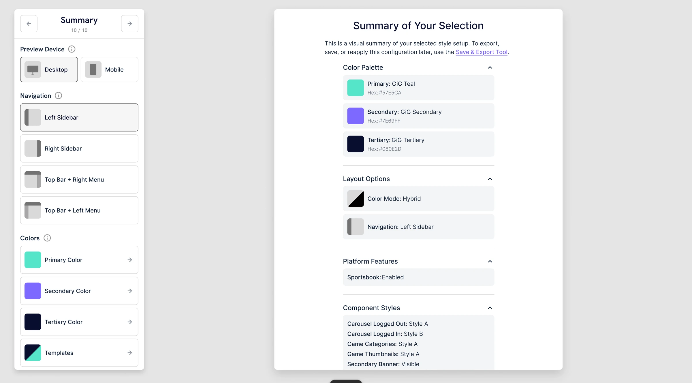
One choice, followed through
From a click to a configuration the team could use.
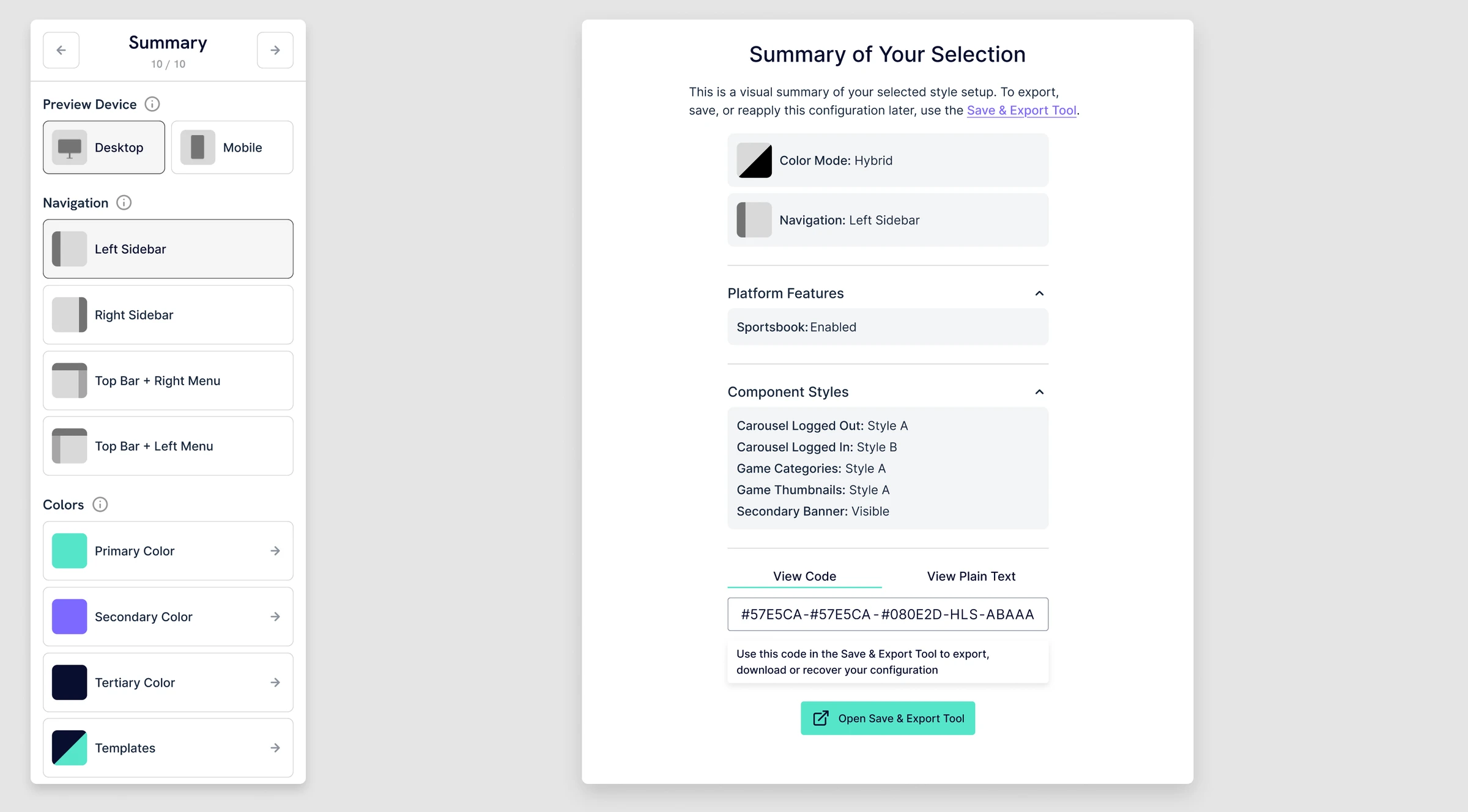
- 01Choose.
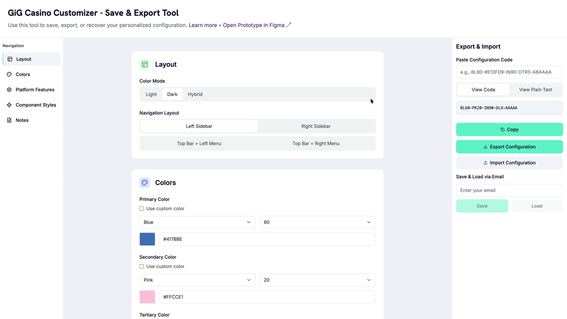
In the Customizer, the client picks a navigation layout: Left Sidebar.
- 02Collect.
The Summary repeats that choice beside every other decision, from colour mode to component styles.
- 03Encode.
The same page condenses the whole selection into one configuration code.
- 04Return.
The Save & Export Tool takes a code like this back in, to copy, export or recover a configuration.
Keep the decisions. Not just the screenshot.
I built the Save & Export Tool in Lovable to bridge the gap between a Figma demonstration and a reusable configuration. Clients could recreate their choices manually, paste the summary’s code or paste its plain text.
From there, they could save and load by email, copy their choices or export JSON. Custom colour values removed the prototype’s palette limit, so a brand’s exact colours could be specified. A notes field captured additional context.
Notes capture extra context separately; they are not part of the compact configuration code.
Explore the Save & Export Tool- ExploreThe client chooses a direction in the Customizer.
- ReturnA summary screenshot, copied configuration or JSON carries the choices back.
- ImplementThe team starts skinning from an agreed reference, not a guess.
Less guessing. A clearer starting point.
Before the Customizer, agreeing a direction could take one to three weeks of proposals and revisions. Once clients could send their own preferred configuration, the skinning work typically took two to three days after their feedback arrived, and was usually approved in the first review.
In version 2.0, that input became a summary screenshot or a configuration from the Save & Export Tool. The handoff was no longer only visual: it could carry explicit choices the team could return to.
- Previously: agreeing a direction
- 1–3 weeks
- With client feedback: skinning
- 2–3 days
From my experience of the client workflow: 1–3 weeks to agree a direction; 2–3 days for skinning once client feedback arrived.
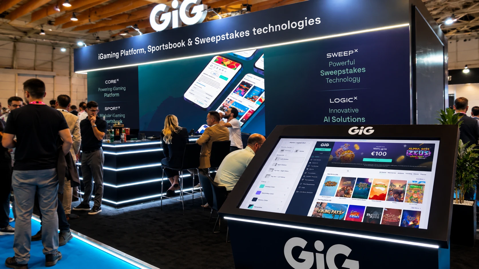
From previewing a casino
to building one.
The Customizer made a configurable experience tangible. The next ambition was XSite Builder: an editor for the new XSite frontend, where operators could assemble pages, manage content and customise the experience themselves.
I translated that ambition into a functional Figma Make prototype. It gave Product and Engineering a concrete reference for how the editor could work, without connecting it to production components.
Make the idea testable.
The demo brought together drag-and-drop composition, component reordering, inline text editing, page settings and colour and typography controls. Instead of discussing an abstract list of capabilities, the team could explore their relationships in one working interface.
This was a reference prototype, not the production editor. As far as I know, XSite Builder has not yet launched; XSite itself is the frontend it was intended to customise.
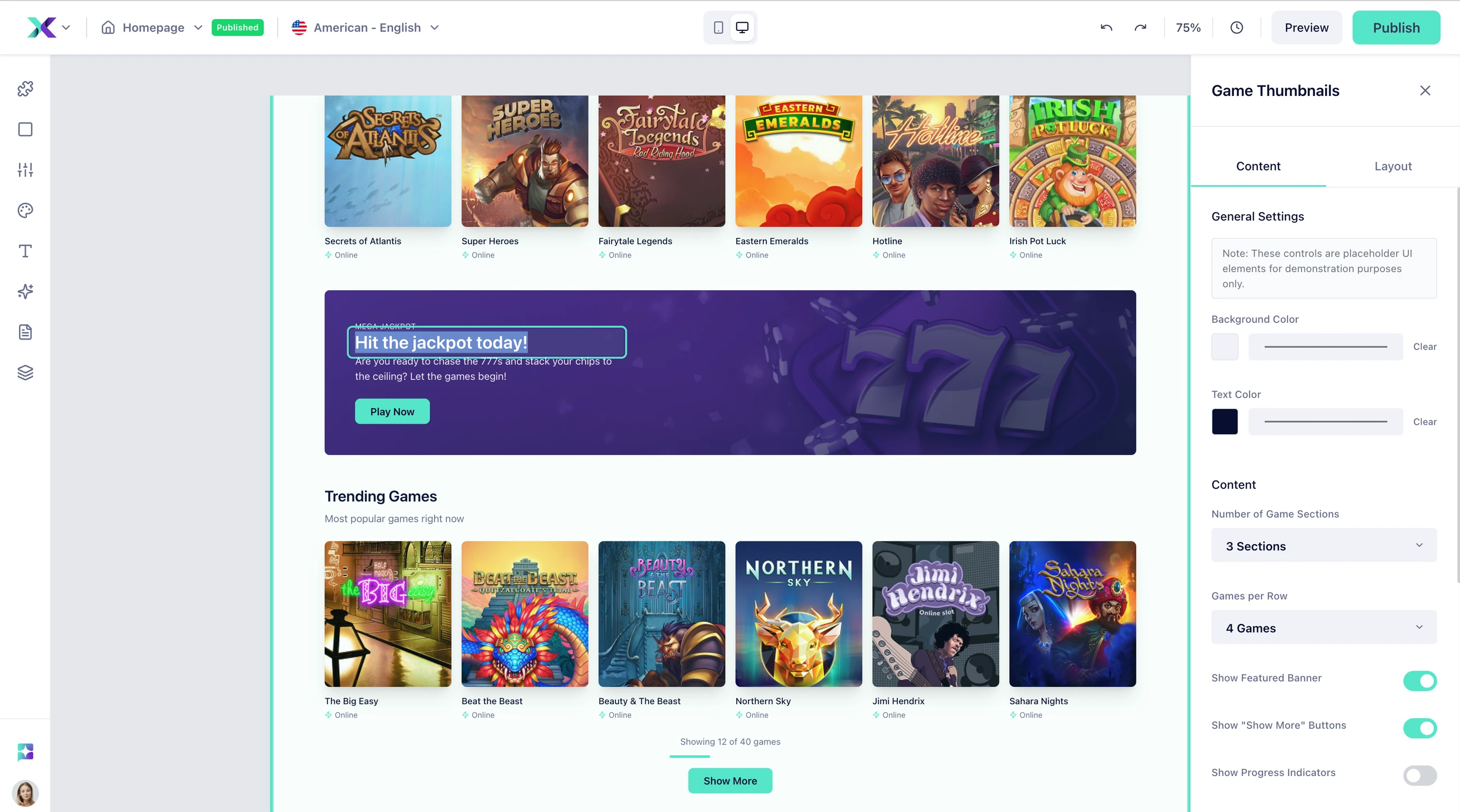
The prototype did not replace development. It made the product direction concrete enough to build from.
The useful output was not the demo. It was a decision the next team could work with.